Why Your Summer Neutrals Stop Working the Moment You Add a Coat

Quick Answer: Summer neutrals fail in autumn for three reasons: lower-angle warmer light shifts how undertones read, heavier fabrics render the same colour deeper and more saturated, and outerwear introduces a fourth neutral that rarely shares an undertone with the other three. A cream-and-taupe pairing that balanced in flat July light will read muddy under a grey October sky with a camel coat over it. The fix is a bridge piece and one deliberate texture contrast, not a new palette.
The outfit was your best one all summer. Cream top, taupe legging, easy.
Put an autumn jacket over it and suddenly everything looks slightly dirty, like three near-misses of the same colour.
Here is exactly what changed.
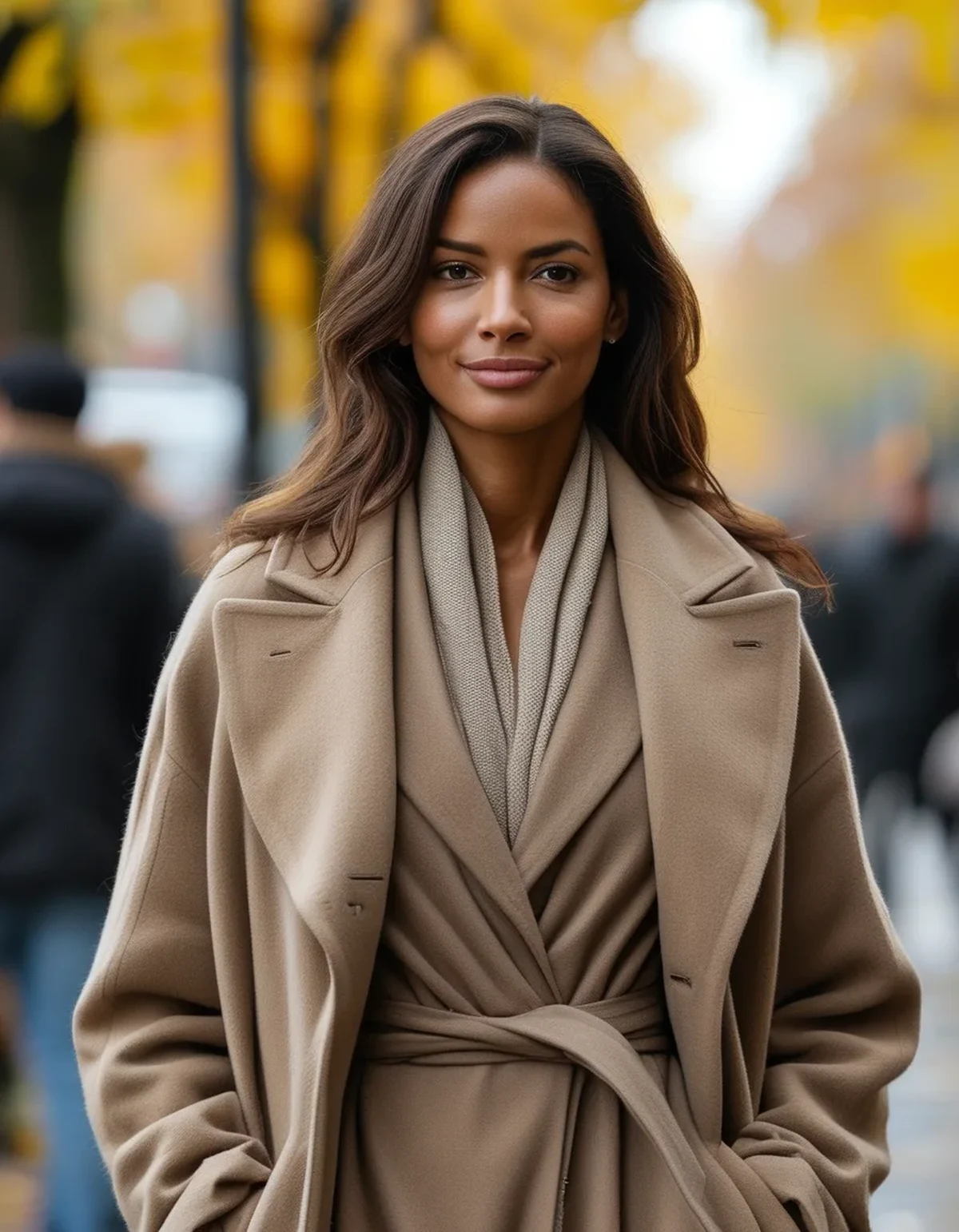
Why do neutrals shift so much between seasons?
Because neutrals are defined almost entirely by their undertone, and undertone is the thing light and fabric weight most affect.
Low-angle autumn sun is warmer. Sunlight travelling through more atmosphere shifts toward the warm end, which pushes cool neutrals toward grey and warm neutrals toward yellow. The same stone legging reads greige in July and khaki in October.
Overcast light is cooler and flatter. The other half of autumn is grey sky, which is a cooler light source and mutes warm neutrals substantially. So your neutrals now read two different ways depending on the day.
Heavier fabric renders colour deeper. More fibre mass means more light absorbed and less transmitted, so an identical dye reads darker and more saturated in a fleece than in a summer jersey. A brand’s cream in a lightweight tank is not the same visual colour as its cream in a sweatshirt.
Texture changes perceived value dramatically. A matte heavy knit and a smooth light jersey in the same colour look like different colours, because the amount of light scattered back differs.
Outerwear adds a fourth neutral to a three-neutral outfit. Most people build a summer neutral outfit with two or three pieces. The jacket is chosen separately, usually years earlier, and almost never shares an undertone.
And indoor lighting joins in. From October you are dressing under warm artificial light and being seen in cool daylight, which is why an outfit that looked right at home looks wrong at the shop window.
How do you tell if the undertones actually clash?
There is a fast test and it works in about ten seconds.
Lay the pieces side by side on white in daylight. White is the reference. Against it, a warm neutral shows yellow or peach; a cool one shows grey, pink or blue. Two cool neutrals sit comfortably together; a warm and a cool one look like a mistake.
Photograph them together and look at the photo, not the pile. A camera does not do the perceptual correction your eye does. If they clash in the photo, they clash in reality.
Check under two light sources. Daylight by a window and your usual room lighting. If the pairing survives both, it will survive the season.
Look at the shadow, not the surface. Undertone is most visible where the fabric folds. A cream that looks neutral flat will show its yellow or its pink in the crease.
Rank them by depth. Three neutrals of near-identical lightness read as muddy regardless of undertone. You need a clear light, mid and dark, or the outfit has no structure.
Do not trust product names. Sand, oat, bone, stone and taupe are marketing words, not colour specifications. Two brands’ oats will differ by a large margin.
What actually fixes a four-neutral autumn outfit?
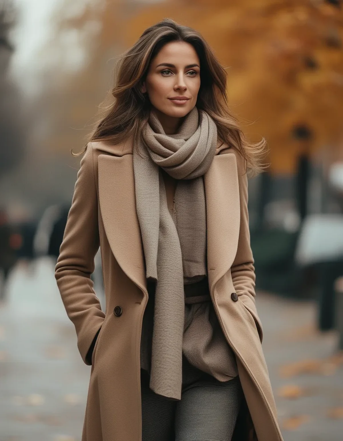
A bridge, a depth ladder and one texture contrast. Three moves, and usually you only need two.
Add a bridge piece that contains both undertones. A scarf, a bag or a knit that is genuinely between warm and cool ties an otherwise clashing pair together. Camel with a grey cast, or a heathered oatmeal, both do this work.
Build a clear light-mid-dark ladder. Cream, taupe, chocolate is legible. Cream, oat, stone is mud. Depth variation does more than undertone matching for the overall effect.
Contrast texture deliberately. Smooth against ribbed against a matte outer. Texture supplies the differentiation that a tight colour range removes, which is the same principle that makes monochrome work.
Anchor with a deep neutral at the extremities. Dark boots or a dark bag give a light outfit a foundation, and light neutral outfits collapse without one in low autumn light.
Choose the outerwear as part of the outfit, not over it. The jacket is the largest area of colour you will wear. Building around it is far easier than trying to make it agree with an existing pair.
Keep cream and white apart. Together they almost always read as one being dirty. Choose one and use the other elsewhere in the outfit at a different depth.
Seasonal note: if you are buying neutral outerwear this season, take a piece of your existing base layer to the shop. Undertone matching from memory fails almost every time, and a coat is the one purchase where getting it wrong costs the whole season.
5 Mistakes That Make Autumn Neutrals Look Muddy
Wearing three neutrals of the same depth. Without a light-to-dark ladder the outfit has no structure and reads flat, particularly under grey skies.
Assuming your summer pairings carry over. Heavier fabrics render the same dye differently. Retest the pairing in autumn weight before assuming it still works.
Mixing warm and cool neutrals with no bridge. This is the specific cause of the muddy effect. One bridge piece fixes it completely.
Choosing a coat in isolation. It is the biggest colour block you own and it dictates everything under it.
Skipping the dark anchor. All-light neutrals in low light with no dark shoe or bag lose their edges and read shapeless.
And the recurring one: judging the outfit in warm bathroom lighting and then walking out into overcast daylight. Check by a window before you commit, every time.
FAQ: Autumn Neutral Questions, Answered
Can I wear warm and cool neutrals together at all?
Yes, with a bridge piece containing both undertones, or with enough depth separation that the contrast reads as intentional.
Why does my beige look grey in autumn?
Overcast light is cool and mutes warm colours. The beige is fine; the light source changed.
Should I switch to a warmer neutral palette for autumn?
Not necessarily. Adding depth and texture usually solves more than swapping undertones.
How do I match neutrals when shopping online?
You largely cannot from a screen. Order two options where possible and compare in your own daylight, or buy from brands whose neutrals you already own.
What is the safest neutral outerwear colour?
A mid-depth camel or a true charcoal both bridge more combinations than cream or stone, which are the hardest.
Does texture really matter that much?
In a tight colour range it is the primary source of visual interest. Two textures is the minimum for a neutral outfit to look considered.
TL;DR:
- Autumn shifts neutrals through warmer low-angle sun, cooler overcast skies and heavier fabrics.
- Outerwear adds a fourth neutral that rarely shares an undertone with the rest.
- Test undertones against white, in a photo, under two light sources.
- Fix with a bridge piece, a clear light-mid-dark ladder, and one texture contrast.
- Anchor light outfits with a dark shoe or bag; keep cream and white apart.
Buy the coat first and build under it. Everything else follows.
See It in Motion
Seen here: Super High Waist Embossed Yoga Leggings with Inner Pocket — shop it on bubblelime.com
Keep Reading
This article is for general informational and styling purposes only. Fit, sizing, and product availability may vary.