Why Neutrals Look Different Under Gym Lighting Than at Home
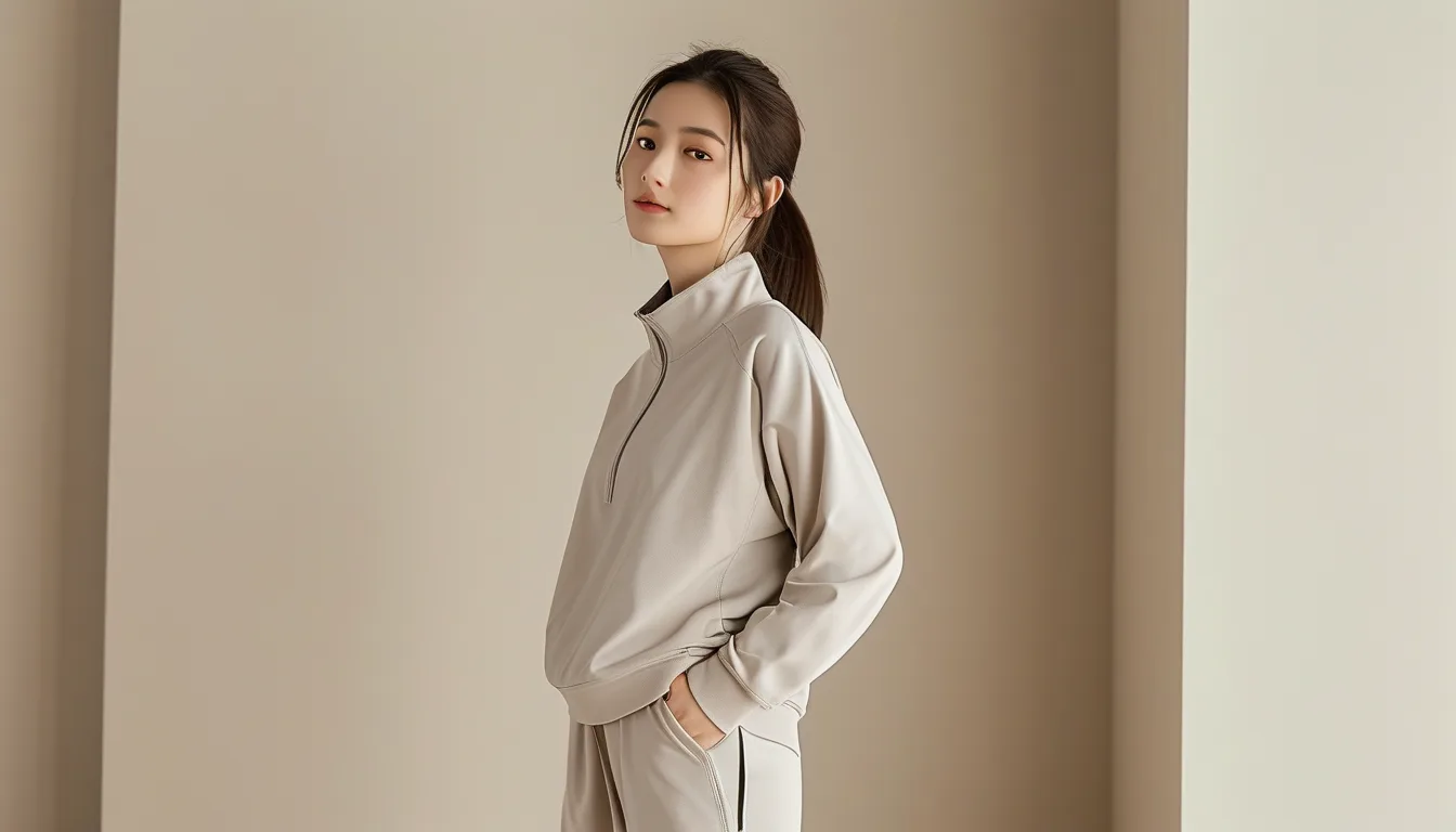
Quick Answer: Neutrals have low saturation, which means their appearance is dominated by whatever hue the light source contributes. Warm home lighting adds amber and makes beige look richer; gym LEDs and fluorescents have spiky spectra that can push the same beige toward grey or green. Saturated colours resist this because they have their own strong hue; neutrals have almost none to defend themselves with.
The less colour a garment has, the more the room decides what colour it is.
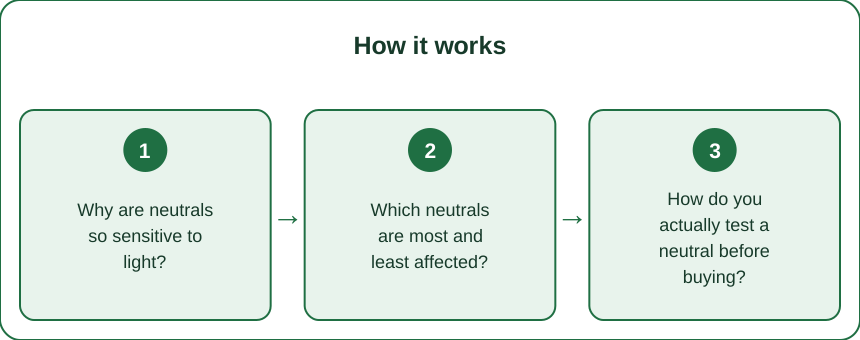
Why are neutrals so sensitive to light?
Because there is not much colour there to begin with, so the light source contributes a larger share of what you see.
The colour you perceive is the product of two things: what the fabric reflects and what the light emits. A saturated red reflects strongly in the red band and weakly elsewhere, so it looks red under almost anything. A beige reflects fairly evenly across the spectrum with a slight warm bias - which means the shape of the light source’s output is doing most of the work.
Change the light and the balance changes:
- Warm incandescent or warm LED, around 2700K, is heavy in amber and red. Beige becomes creamier, taupe becomes warmer, greys pick up a brown cast.
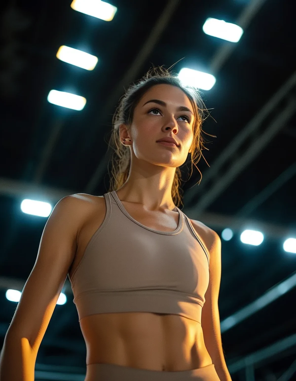
- Cool white LED, 4000 to 5000K, common in gyms, is heavy in blue with a spike in the blue-green region. The same beige loses its warmth and can read grey or faintly green.
- Fluorescent tubes have narrow spikes rather than a smooth curve, which produces the most unpredictable shifts and is why older gyms and changing rooms are notorious.
- Daylight is broad and even, and is the reference standard for a reason.
The technical term for the underlying problem is metamerism - two fabrics can match under one light source and diverge under another, because their spectral reflectance curves differ even where the perceived result matched. For neutrals this affects not just matching but the colour itself, and it is why an outfit assembled at home can look like a different outfit at the studio.
Colour Rendering Index is worth knowing about. CRI measures how faithfully a light source renders colour against daylight. Cheap LEDs with a CRI under 80 distort noticeably, and a lot of commercial gym lighting sits in that range, chosen for efficiency rather than fidelity.
Which neutrals are most and least affected?
It tracks saturation and undertone complexity.
Most affected - shift the most between light sources:
- Oatmeal, greige, and taupe. Complex undertones that sit between warm and cool, so any light source can pull them one way or the other. These read differently in almost every room.
- Soft sage and muted olive. Low saturation greens are especially prone to shifting toward grey under cool light.
- Blush and nude tones. Highly sensitive because they are close to skin tones, and the eye compares them to your skin, which is also shifting under the same light.
- Light grey. Almost no hue of its own, so it takes on whatever the room offers - the most chameleon-like of all.
Least affected - stay recognizable anywhere:
- Black and charcoal, since there is little reflection to tint
- True white, which shifts in warmth but stays unmistakably white
- Deep navy and deep chocolate, dark enough that hue shifts are subtle
- Cream, more stable than beige because it is lighter and warmer to start with
The practical implication for building a wardrobe: if you want pieces that look the same everywhere - work, gym, outdoors, photos - build around the stable end of that list and use the shifting neutrals as accents rather than as the base you are matching everything else to.
And a specific warning about matching two shifting neutrals. Two greige pieces that match at home can diverge under gym light, because they may have different spectral curves. Matching two low-saturation neutrals is the hardest matching problem there is, harder than matching two navies, and it is worth checking in daylight before committing.
How do you actually test a neutral before buying?
Three checks, all quick, and the first one solves most of it.
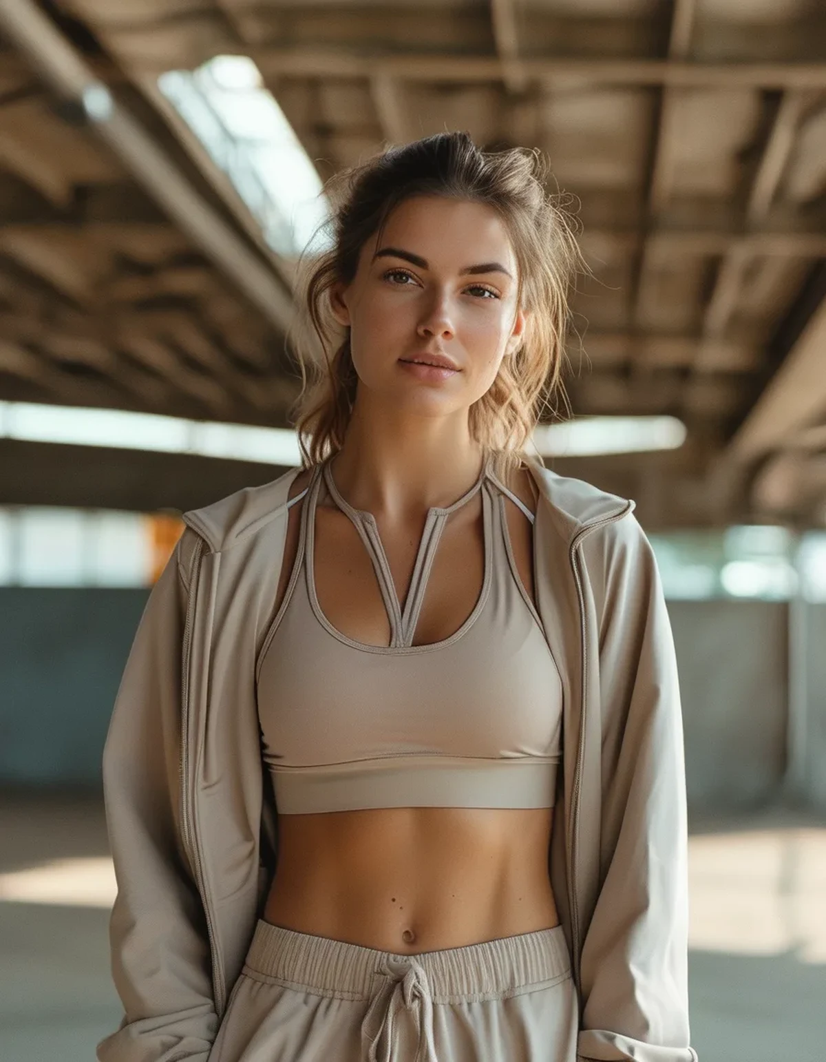
1. Take it to daylight. Walk to a window or a doorway. Daylight is the reference standard, and it is also the condition under which most photos of you will be taken. Store lighting is deliberately warm and flattering; whatever you see there is the best case.
2. Check it against your skin, not against the hanger. Neutrals interact with your undertone. Hold it up under your jaw and look at whether your skin looks brighter or greyer. A neutral that washes you out at the neckline still works as a legging, so this check matters most for tops.
3. Photograph it with the flash on. Camera flash has a broad spectrum close to daylight, and it exposes undertones the eye compensates for. This is the fastest way to see whether a beige is really a warm beige or a cool one.
Then two habits that matter afterwards:
Know your gym’s lighting. If your studio has cool white LEDs, assume neutrals will read cooler and slightly flatter than at home. You can compensate by choosing warmer neutrals than you would otherwise, which will land where you expected under those lights.
Use texture to carry the outfit instead of colour. Because the colour is not stable, the thing that stays reliable is texture and structure. A ribbed top with a smooth legging reads as intentional under any light, whereas a flat two-piece in matching neutrals depends entirely on the colour holding up.
On fading, which compounds this. Neutrals fade unevenly - some beiges lose warmth and drift grey, some greys pick up yellow from detergent residue and body oils. Washing in cold water, avoiding optical brighteners, and drying out of direct sun all slow it. A faded neutral shifts undertone rather than simply lightening, which is why an old beige piece stops matching a newer one from the same brand.
Myth vs Fact: Neutrals and Lighting
Myth: If it looks good in the store it will look good anywhere. Fact: Retail lighting is warm and deliberately flattering. Daylight is the honest test and the one that matches how you will be seen.
Myth: Neutrals are the safe choice. Fact: Safe in the sense of versatile, unstable in the sense of colour. Low saturation means the light source dominates the appearance.
Myth: Two neutrals from the same brand will match. Fact: Different fabrics take dye differently and different production runs vary. Low-saturation matching is the hardest kind, and same-brand is not a guarantee.
Myth: Phone photos show the true colour. Fact: Automatic white balance actively adjusts the whole image, often correcting away the exact cast you are trying to see. Flash on, in a neutral room, is the closest a phone gets.
Myth: The garment changes colour over time only by fading lighter. Fact: Neutrals frequently shift undertone as they fade - warm beiges drift grey, greys pick up yellow - which is why old and new pieces stop matching.
Myth: Undertone advice is just marketing. Fact: The interaction between fabric undertone and skin undertone is a real perceptual effect. Whether you organize a wardrobe around it is a preference; whether it exists is not.
FAQ: Neutrals and Lighting Questions, Answered
Why does my beige look green at the gym?
Cool white LEDs have a spike in the blue-green part of the spectrum. A beige with any cool undertone picks that up and reads green, particularly under lower-CRI lighting.
How do I find my undertone quickly?
Compare how you look against a warm cream and a cool white in daylight. Whichever makes your skin look brighter rather than greyer points to your undertone. Vein colour tests are popular and unreliable.
Which neutrals are safest for photos?
Charcoal, deep navy, cream, and true white. All are stable enough that they read the same under most light sources.
Can I match two beiges from different brands?
It is the hardest matching problem in clothing. Check both together in daylight, and if they are close but not identical, separate them with a contrasting element rather than wearing them adjacent.
Do neutrals show sweat more than black?
Yes - mid-tone neutrals show damp patches most because the wet-dry contrast is greatest. Very light and very dark colours both hide it better than mid-tones.
TL;DR:
- Neutrals have low saturation, so the light source contributes most of the hue you actually see.
- Warm home lighting enriches beige; cool gym LEDs strip the warmth and can push it toward grey or green.
- Oatmeal, greige, taupe, sage, and light grey shift most. Charcoal, navy, cream, and white stay stable.
- Test in daylight, against your skin, and with camera flash on - three checks, under a minute.
- Let texture carry the outfit, because colour is the unstable variable under changing light.
Walk any neutral to a window before buying. Store lighting is the best case, not the real one.
See It in Motion
Seen here: High Waist Yoga Leggings with Inner Pocket — shop it on bubblelime.com
Keep Reading
This article is for general informational and styling purposes only. Fit, sizing, and product availability may vary.