Why Neutral Outfits Sometimes Look Muddy Instead of Effortlessly Put Together

Quick Answer: Neutral outfits look muddy, not polished, when warm-undertone neutrals (beige, camel, warm taupe) are mixed with cool-undertone neutrals (grey, cool taupe, stone) in the same outfit — the undertone clash creates a visual dissonance that reads as ‘off’ even though every individual piece is technically a neutral color, and matching within the same undertone family fixes it almost immediately.
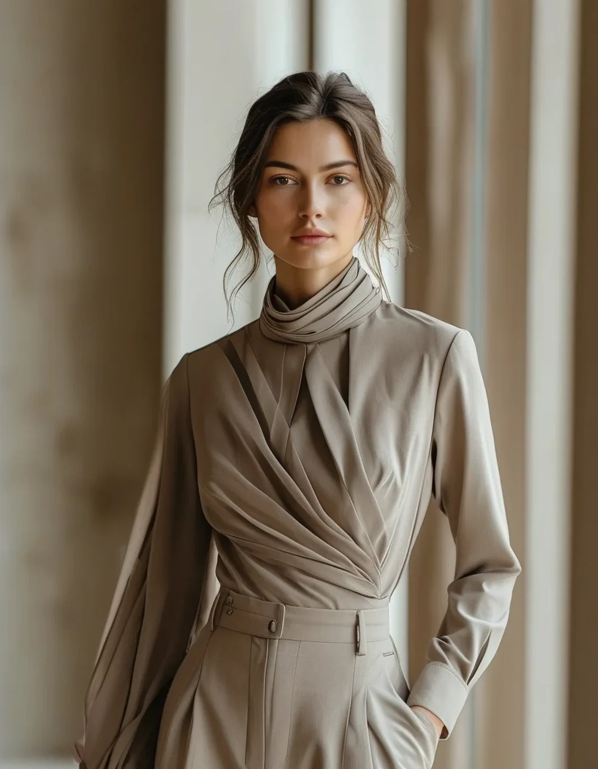
Every piece in the outfit is technically a neutral. And yet, together, the outfit reads muddy and mismatched rather than clean and elevated the way neutral outfits are supposed to look. The individual colors aren’t the problem — their undertones not matching each other is.
Why can two ‘neutral’ colors clash if they’re both technically neutral?
Neutral doesn’t mean undertone-free — beige, taupe, grey, and stone all lean either warm (yellow or orange base) or cool (blue or grey base) even within the neutral family, and pairing a warm neutral with a cool one creates the same kind of visual dissonance as pairing a mismatched warm and cool shade in any other color family, just less obviously since both read as ‘neutral’ at a glance.
How can you actually tell if a neutral leans warm or cool?
Hold the item next to a true white or a true grey in good natural light — a warm neutral will show a yellow, gold, or orange cast against the reference, while a cool neutral will show a blue, grey, or slightly purple cast. This comparison is far more reliable than judging the item alone, since undertones are easy to misjudge in isolation.
Does lighting affect how visible this undertone mismatch actually is?
Yes — warm indoor lighting can mask a cool-neutral and warm-neutral mismatch that becomes much more obvious in natural daylight, which is part of why an outfit can look fine getting dressed indoors and then look off once outside.

What’s the fastest way to avoid this mistake when building a neutral wardrobe?
Pick one undertone family (warm or cool) as your primary base and build most core neutral pieces within it, then use a true black, white, or a deliberately chosen contrasting accent piece to add variation rather than mixing warm and cool neutrals as your default combination.
Does skin undertone affect which neutral family looks best on a given person, separate from the matching-within-outfit issue?
Yes, that’s a related but separate consideration — beyond just matching neutrals to each other, choosing an overall neutral family (warm or cool) that also complements your own skin undertone tends to look most cohesive and flattering overall.
FAQ: Neutral Outfit Undertone Matching, Answered
Can black and white be mixed into any neutral outfit safely?
Generally yes — true black and true white read as undertone-neutral themselves and pair reasonably well with either warm or cool neutral families as an anchor or contrast piece.
Is it worth checking undertone before every neutral purchase?
For core pieces meant to mix-and-match frequently, yes — a quick undertone check prevents buying pieces that technically qualify as neutral but won’t coordinate with what you already own.
Does texture help disguise a slight undertone mismatch?
Somewhat — textural contrast (a matte fabric next to a subtle sheen) can distract the eye a little from a slight undertone clash, though it doesn’t fully resolve a strong mismatch.
TL;DR:
- Neutral colors still carry warm or cool undertones, and mixing the two families creates a muddy, mismatched look
- Comparing an item against true white or grey in daylight reveals its actual undertone more reliably than judging it alone
- Natural daylight reveals undertone mismatches that warm indoor lighting can mask
- Picking one undertone family as your core base, with black/white or a deliberate accent for contrast, avoids the problem
Next time a neutral outfit looks muddy instead of polished, check for a warm-cool undertone clash before assuming the individual pieces are the problem.
Keep Reading
This article is for general informational and styling purposes only. Fit, sizing, and product availability may vary.