Why Neutral Outfits Sometimes Look Flat and Muddy Instead of Effortlessly Put Together
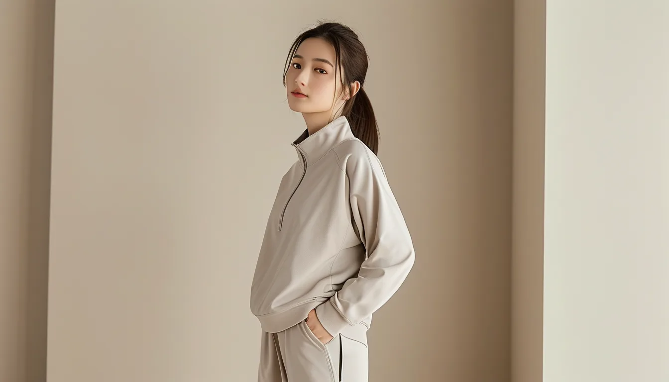
Quick Answer: Neutral outfits look muddy rather than polished most often because the individual pieces have mismatched undertones — warm beige paired with cool taupe, for instance — which creates visual dissonance even though every piece is technically “neutral”; matching undertones across pieces (all warm or all cool) and adding texture contrast are the two adjustments that most reliably fix the muddy look.
A neutral outfit that looks accidentally muddy usually isn’t a fault of the color category itself — it’s a mismatch between undertones that happen to both be called “neutral” on the label but don’t actually coordinate.
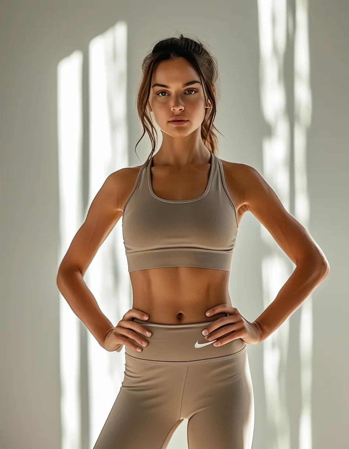
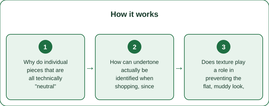
Why do individual pieces that are all technically “neutral” sometimes clash instead of coordinating?
Neutral colors like beige, tan, taupe, and cream each carry an underlying warm or cool undertone, even though the category as a whole is marketed as universally coordinating. Pairing a warm-undertone beige with a cool-undertone taupe, for example, creates a subtle but real visual clash, which is what produces that flat, slightly muddy look, despite both pieces reading as “neutral” individually.
How can undertone actually be identified when shopping, since it’s not usually labeled directly?
Comparing a neutral piece next to a known pure white item is one of the more reliable identification methods — a neutral that reads slightly yellow or pink-toned against white leans warm, while one that reads slightly gray or blue-toned against white leans cool. Checking this comparison before combining new neutral pieces with an existing wardrobe item catches undertone mismatches before they show up in the mirror.
Does texture play a role in preventing the flat, muddy look, separate from undertone matching?
Yes — texture contrast between pieces (a ribbed knit top with a smooth-finish legging, for example) adds visual interest and dimension that a same-undertone but same-texture neutral outfit can still lack. Texture variation prevents the outfit from reading as one flat block of color even when the undertones are correctly matched.
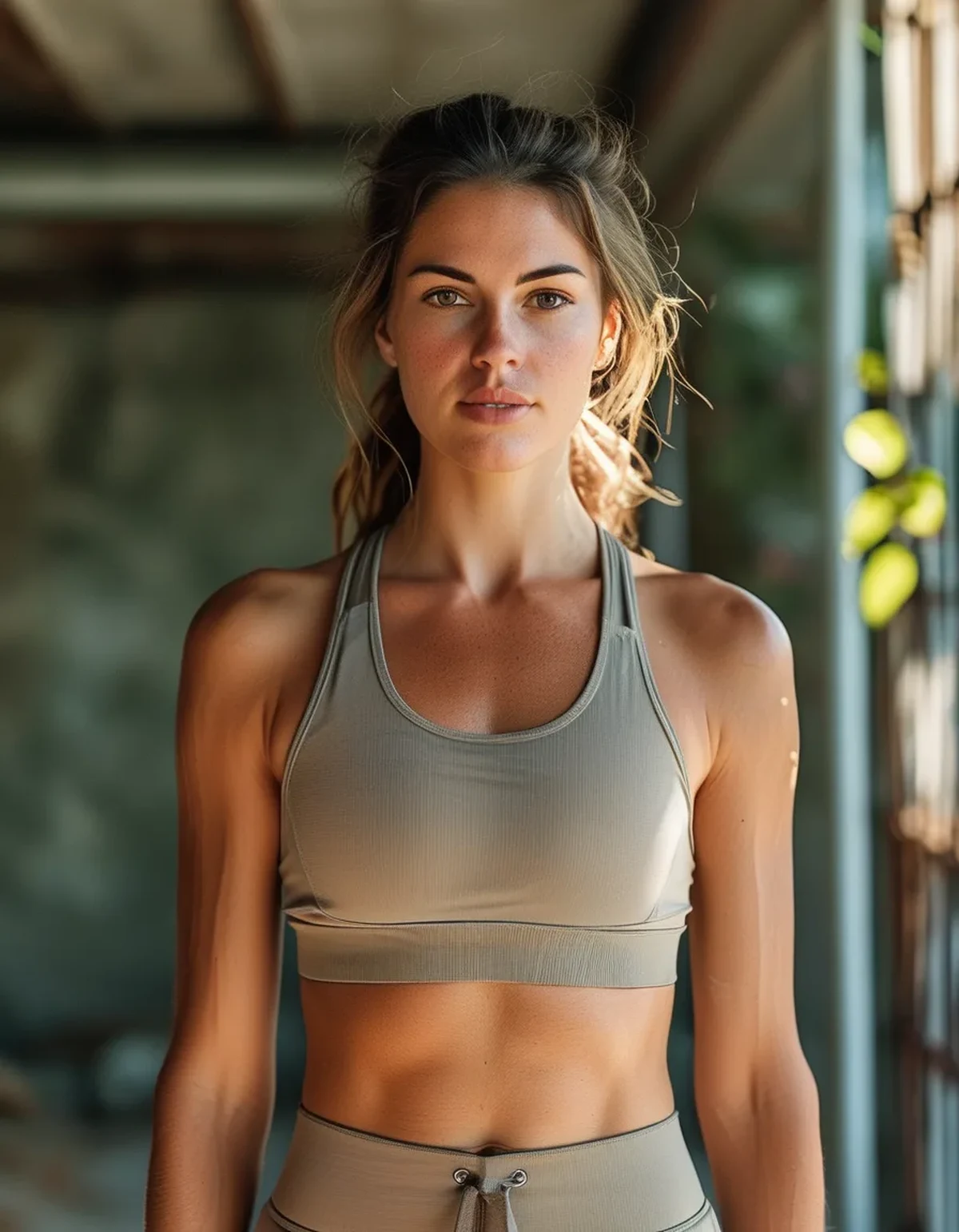
Is there a reliable formula for building a neutral outfit that reads elevated rather than flat?
Matching undertones as the base rule, then adding one texture contrast and one tonal contrast (a noticeably lighter or darker neutral shade within the same undertone family) produces the most reliably elevated result. An all-warm-beige outfit with one item in a deeper warm brown and one item in a ribbed or textured fabric reads far more intentional than three pieces of the exact same shade and texture.
Myth vs Fact: Styling Neutral Outfits
Myth: Any neutral color pairs well with any other neutral color. Fact: Undertone mismatches between technically-neutral colors are one of the most common causes of a muddy, uncoordinated look — matching undertone matters as much as matching the general neutral category.
Myth: An all-one-shade neutral outfit is the safest, most put-together option. Fact: A single flat shade throughout, without any texture or tonal variation, often reads as visually flat rather than elevated — some contrast within the same undertone family looks more intentional.
FAQ: Neutral Outfit Styling, Answered
Is black or navy ever considered part of a warm or cool neutral palette?
Both typically read as cool-leaning, which is why black or navy paired with warm beige or tan can create a subtler version of the same undertone clash discussed above.
Does skin undertone need to match the outfit’s undertone for the outfit to look good?
Not strictly, but many people find warm-undertone neutrals more flattering against a warm skin undertone and vice versa — this is a secondary consideration worth experimenting with, separate from the outfit’s internal undertone consistency.
What’s the fastest way to check if an existing wardrobe already has an undertone mismatch problem?
Laying several neutral pieces flat next to each other in natural daylight and looking for any that visually “pop” as slightly more yellow, pink, gray, or blue compared to the rest is a fast, effective at-home check.
TL;DR:
- Neutral colors carry warm or cool undertones that don’t automatically coordinate just because both are “neutral”
- Comparing against pure white reveals a piece’s true undertone before combining it with existing items
- Texture contrast and tonal variation within the same undertone family prevent a flat, muddy look
- An all-one-shade neutral outfit often reads flatter than one with deliberate texture or tonal contrast
A muddy-looking neutral outfit is almost always a fixable undertone mismatch rather than a flaw in neutrals as a styling category — matching undertones is the real coordinating rule neutrals actually run on.
Keep Reading
This article is for general informational and styling purposes only. Fit, sizing, and product availability may vary.