Why Neutral Activewear Shows Sweat Marks More Than Black Does

Quick Answer: Wet fabric looks darker than dry fabric because water fills the air gaps between fibres and reduces light scattering, so the contrast between wet and dry areas depends on how light the fabric is to begin with. A dark fabric is already absorbing most light, so wetting it changes very little. A mid-tone neutral has the largest possible gap between its dry and wet appearance, which is why oat and sand are the worst offenders and why very pale cream is often better than mid-beige. Fabric structure and fibre content change it further.
You buy the sand-coloured set because it looks expensive and calm and nothing like the black you already own.
Twenty minutes into a session there is a visible map of your workout down your back. Black would have shown nothing. This is not a quality problem, and knowing the mechanism lets you pick neutrals that behave.
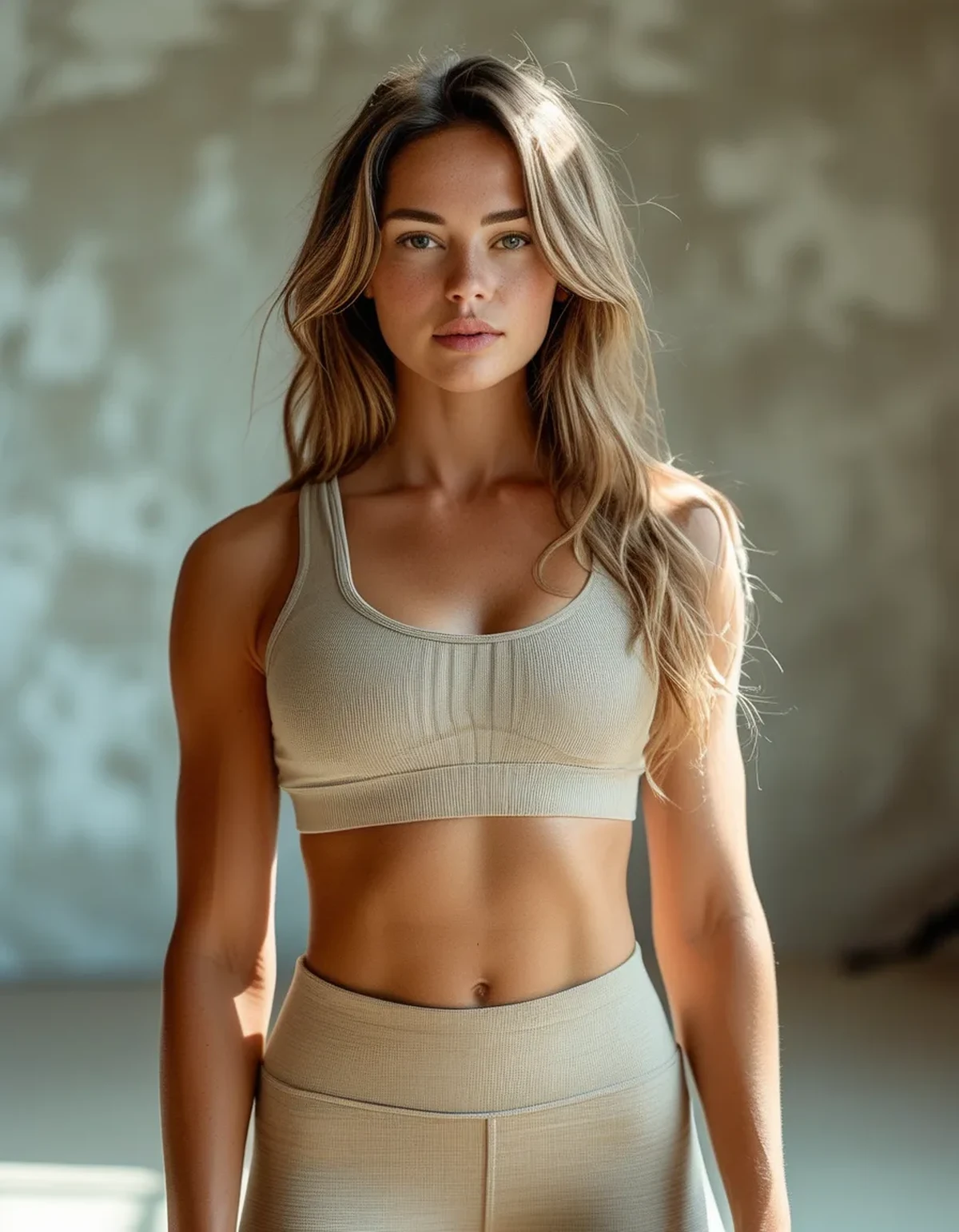
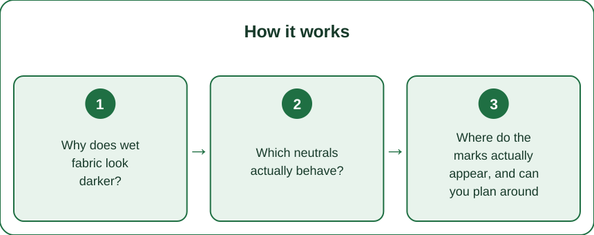
Why does wet fabric look darker?
Because water changes how light behaves inside the fabric, not because it adds any colour.
Dry fabric scatters light. A textile is fibres with air between them. Light entering the fabric hits many fibre-air boundaries and bounces off in all directions. Much of it scatters back out toward your eye, which is what makes the fabric look light and opaque.
Water fills the gaps and stops the scattering. Water has a refractive index much closer to that of textile fibres than air does. When water replaces the air, light passes through the boundaries instead of bouncing off them. Less light comes back out, more is absorbed inside, and the fabric appears darker and more transparent.
Why this affects light colours most. The visual effect is a contrast between wet and dry regions. On black fabric, almost all light is being absorbed already whether wet or dry, so the change is small and the contrast is low. On a mid-tone fabric, a large amount of light was scattering back and now is not, so the change is dramatic.
The counterintuitive part: very pale is sometimes better than mid-tone. A near-white fabric wetted still returns a good amount of light, so it darkens to a light grey rather than to a strongly contrasting tone. A mid-beige darkens to a deep brown. In practice the worst zone is roughly the mid-tone range, and both ends of the lightness scale perform better than the middle.
A note on transparency, which is a separate issue. Wet fabric also becomes more see-through by the same mechanism. This is why light-coloured leggings are a problem when wet even where sweat marks are not visible against the surroundings.
Which neutrals actually behave?
It depends on lightness, fibre, and structure, and the three interact.
By lightness, from best to worst:
- Near-white and very pale cream. Show marks least dramatically, and become more transparent, so they need a thicker fabric.
- Charcoal and deep taupe. Close enough to dark that the contrast is small.
- Light greige and pale sand. Moderate.
- Mid-beige, oat, camel, and warm sand. The worst zone. Maximum contrast between wet and dry.
- Mid grey. Notoriously the single worst colour for showing sweat, which is why it is the standard visual shorthand for it.
By fibre:
- Polyester is hydrophobic and does not absorb much water into the fibre itself, so marks appear and also dry quickly and spread less.
- Nylon absorbs somewhat more and holds marks slightly longer.
- Cotton and cotton blends absorb heavily, spread widely, and stay marked for the rest of the session. Avoid for anything sweaty in a light colour.
- Modal and bamboo viscose are highly absorbent and among the worst for this.
By structure:
- Textured surfaces hide marks better than smooth ones, because the varied surface already produces varied light return, so a wet patch is less obviously a change.
- Brushed or peached finishes hide marks well for the same reason.
- Smooth, high-lustre compression fabric is the most revealing.
- Ribbed is somewhat better than flat, since the ridges break up the visual field.
- Marled or heathered yarns hide marks noticeably better than solids, because the fabric already has tonal variation.
The best-performing neutral, combining all three: a textured or heathered polyester in either a very pale or a deep tone. The worst: a smooth mid-beige cotton blend.
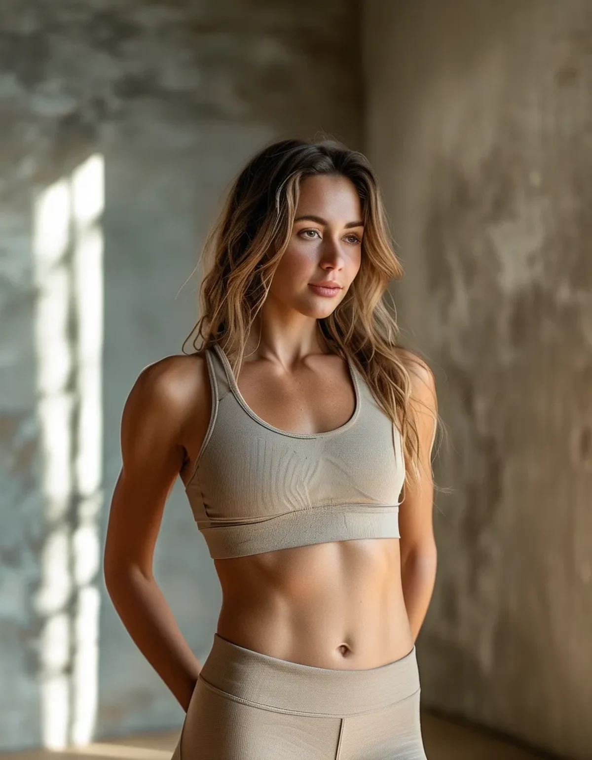
Where do the marks actually appear, and can you plan around it?
Sweat distribution is predictable, which means placement of colour and panels is a legitimate strategy.
The high-output zones, in rough order:
- Centre back, along the spine, which is the most common and most visible
- Lower back and waistband, particularly where a waistband traps moisture
- Underbust, along the band of a sports bra
- Underarms
- Behind the knees, on leggings
- Inner thigh, on leggings, where friction and heat combine
What this means for buying:
- Colour-blocked garments with a darker panel through the centre back or the underbust are doing something functional, not just decorative.
- A darker waistband on light leggings hides the most common legging mark.
- Mesh panels in high-sweat zones both ventilate and disguise, since mesh is visually broken up already.
The layering strategy. A light-coloured top over a dark base layer at the high-output zones works, and adds heat. A better version is a light outer layer that is not in direct contact with the skin at the back, which is what a slightly looser cut achieves.
On the specific problem of the sit-down mark. Light leggings worn to a class and then sat on a mat pick up a visible mark at the seat from both sweat and mat contact. There is no fabric solution to this, and it is a reason to keep light-coloured bottoms for lower-output activity.
A realistic conclusion: for high-output training, light neutrals are a compromise you make deliberately. For walking, pilates, yoga in a cool room, or wearing to and from the gym, they are entirely practical.
What Nobody Tells You About Sweat and Light Fabric
Salt marks are a separate and permanent-looking problem. As sweat dries it leaves salt and urea behind, which on dark fabric shows as white residue and on light fabric shows as a yellowish stiff patch. This builds up over washes if not addressed. A cold rinse before washing, and washing promptly rather than leaving damp kit in a bag, prevents most of it.
Antiperspirant is the main cause of yellowing, not sweat. Aluminium salts react with proteins in sweat and with the fabric, producing yellow discolouration and stiffening. This is why underarm marks are permanent on light fabric. Applying antiperspirant at night, when sweat glands are less active, improves absorption and leaves less residue on clothing.
Deodorant residue also makes fabric hold odour. The buildup blocks the fabric’s structure so detergent cannot reach the odour compounds trapped underneath. A periodic soak in a solution designed for technical fabric, or a wash with an oxygen-based additive, resets this.
Sweat rate varies enormously, and it is trainable in one direction. Fitter people sweat earlier and more, because thermoregulation becomes more efficient. So a light-coloured kit that worked when you started training may show more as your fitness improves, which feels backwards and is a sign of adaptation.
Humidity matters more than temperature. Sweat cools you by evaporating. In high humidity it evaporates poorly, so it accumulates on the fabric rather than leaving as vapour. The same session in the same temperature produces far more visible marking on a humid day.
Fabric weight changes when marks appear, not whether. A heavier fabric absorbs more before saturation shows, so marks appear later and then spread more. A very light fabric shows sooner and dries faster.
Two-tone and print options are the practical answer nobody suggests. If you want light-coloured activewear that survives a hard session visually, a subtle print, a marl, or a two-tone construction does more than any fabric technology. The pattern gives your eye somewhere else to go.
Seasonal note: autumn training is a brief window where light neutrals work better than they will all year, since cooler air means less sweat and lower humidity than late summer. It is the right season to actually wear the oat set, and worth remembering that the same piece will behave differently next July.
FAQ: Neutral Activewear and Sweat, Answered
Why does light activewear show sweat so much more than black?
Water fills the air gaps in fabric and stops light scattering back out, so wet areas look darker. Black already absorbs most light so it changes little. Mid-tone neutrals have the largest gap between dry and wet appearance.
What is the worst colour for showing sweat?
Mid grey, followed by mid-beige, oat, and camel. Very pale cream and deep charcoal both perform noticeably better, because the contrast between wet and dry is smaller at both ends of the lightness scale.
Does fabric type matter as much as colour?
Almost. Polyester shows marks less and dries fastest. Cotton, modal, and bamboo viscose absorb heavily and hold marks. Textured, heathered, or brushed surfaces hide marks considerably better than smooth ones.
TL;DR:
- Wet fabric looks darker because water stops light scattering, and the visual gap is largest in mid-tone colours.
- Mid grey, oat, and camel are the worst. Very pale cream and deep charcoal are considerably better.
- Textured, heathered, and brushed surfaces hide marks far better than smooth compression fabric.
- Antiperspirant, not sweat, causes the permanent yellowing at the underarm. Apply it at night.
Check the fibre content on your favourite light set. If it says cotton or modal, that is the whole explanation.
See It in Motion
Seen here: High Waist Embossed Yoga Leggings with Side Pockets — shop it on bubblelime.com
Keep Reading
This article is for general informational and styling purposes only. Fit, sizing, and product availability may vary.