Why Neutral Activewear Looks Different in a Phone Photo Than in Person
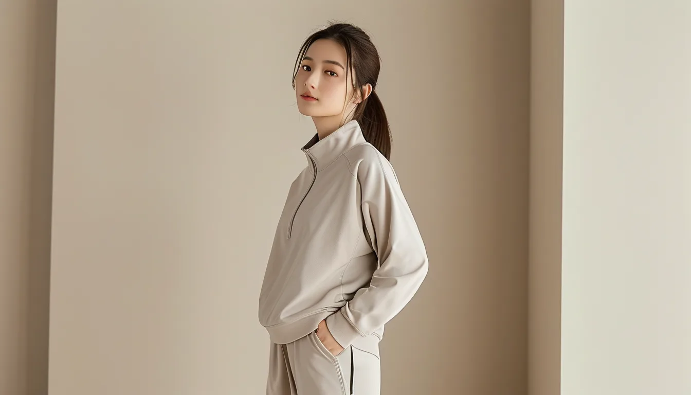
Quick Answer: Your phone rewrites color before you ever see the image. Auto white balance decides what counts as white in the room and shifts every other color to match, and neutrals - which sit within a few percent of grey - move the furthest. Add HDR contrast, skin-tone priority, and the fact that beige has almost no saturation to anchor it, and a warm oat set can land somewhere between grey and olive. The fix is to photograph neutrals in a single light source and lock exposure before you shoot.
Which matters because most of us now decide whether an outfit works by glancing at a photo of it.
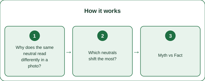
Why does the same neutral read differently in a photo?
Because a camera is not recording color - it is guessing at it.
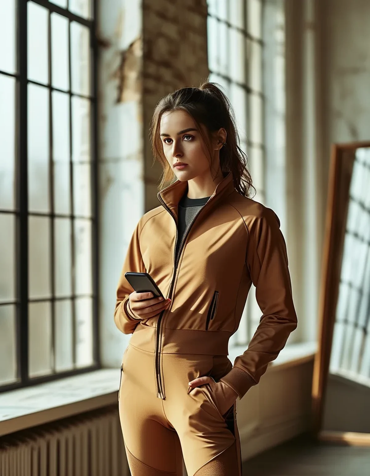
Auto white balance is the main culprit. Your phone looks at the scene, decides which object is supposed to be neutral white, and then shifts the entire image so that object becomes white. If your bathroom has warm bulbs, the phone pulls the whole frame cooler to compensate - and your warm beige leggings go with it, landing grey or faintly green.
Neutrals have almost nothing to hold onto. A red top is unmistakably red even after a big white-balance shift, because saturation gives it an anchor. Oat, taupe, greige, and bone sit within a few percentage points of neutral grey, so a shift that barely touches a saturated color moves them across a visible boundary.
Skin-tone priority makes it worse. Modern phones actively protect faces - they detect skin and tune warmth around it. In a mirror selfie, your face is the anchor and your outfit is collateral. The same set photographed without you in frame often comes out a different shade.
And HDR flattens the tonal separation that made two neutrals look distinct in the room. Cream and white, two feet apart in real life, merge into one pale block on screen.
Which neutrals shift the most?
There is a clear ranking, and it explains a lot of shopping disappointment.
Greige and mushroom shift most. They are deliberately balanced between warm and cool, which means they have no built-in resistance - whichever way the white balance leans, they follow. The same mushroom sports bra can photograph pink-tinged indoors and green-tinged outdoors on the same afternoon.
Cream and bone are next. They are close enough to white that the camera sometimes mistakes them for white and calibrates against them, which drags everything else warm and makes the cream itself read flat and paper-like.
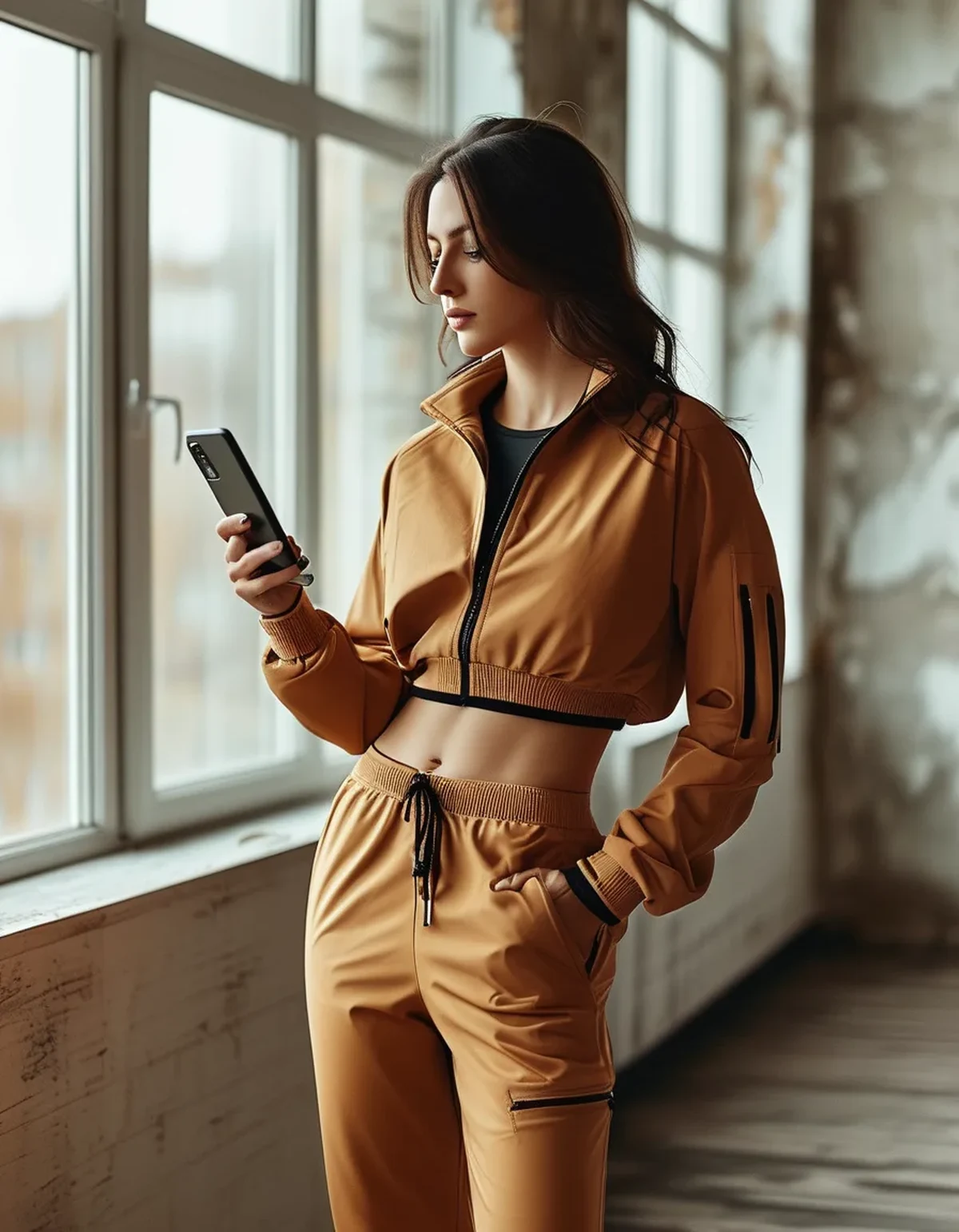
Warm sand and camel are more stable because they carry enough yellow-orange to survive a shift, though they will still cool down noticeably under fluorescent gym light.
Charcoal and true black barely move, which is one honest reason black activewear dominates - it photographs the same everywhere.
The practical read: if a product photo shows a neutral you cannot quite name, assume the real garment is warmer than the image. Brand photography is usually shot with cool, controlled lighting, which pushes beiges toward grey more often than the reverse.
Myth vs Fact: Neutral Activewear and Cameras
Myth: a better phone camera would fix it. Fact: better sensors make the guess more confident, not more literal. Flagship phones apply more computational color processing, not less. The gap between eye and photo often widens on newer phones.
Myth: the mirror is showing the true color. Fact: your eyes chromatically adapt within about a minute of entering a room - your brain is running its own white balance. Neither the mirror nor the photo is neutral ground. Daylight near a window is the closest thing to a reference either of you has.
Myth: if it photographs badly it will look bad in person. Fact: these are separate questions. A set that reads muddy on your phone can look excellent in the room. Decide in daylight, not on the camera roll.
Myth: matching sets solve it. Fact: matching sets expose the problem, because two pieces of the same dye lot in different fabric weights reflect light differently. A ribbed bra and a smooth legging in one colorway can photograph as two shades.
Myth: editing can put the color back. Fact: you can warm an image globally, but that drags your skin tone with it. Getting it right at capture is far easier than fixing it after.
How do you photograph neutrals accurately?
Five adjustments, none of which need an app.
1. Use one light source. Mixed lighting - a window on one side, a warm bulb overhead - gives the camera contradictory information and it will pick a compromise that suits neither. Turn the overhead off and stand near the window.
2. Lock exposure and focus. Press and hold on the outfit until the lock indicator appears. This freezes the white balance too, so it stops re-calculating as you move.
3. Put something genuinely white in frame. A white towel or a sheet of paper gives the camera a real reference. It stops guessing and starts measuring.
4. Shoot the outfit without your face for the color check, then take your normal photo. Removing the skin-tone priority gives a truer read on the fabric.
5. Check in north-facing daylight for anything you are deciding about. Indirect daylight is the most consistent light most homes have, and it is roughly what the garment will look like outdoors.
And for online shopping specifically: look for the photo in the listing that includes a white or black element - a shoe, a wall, a label. That frame is the most trustworthy one, because it gives you a reference point the marketing image does not.
As late-summer light shortens through September, the same routine matters more: the golden-hour window that flattered your neutrals in July arrives earlier and lasts less time.
FAQ: Neutral Color and Photos, Answered
Why do my beige leggings look green in photos?
Almost always auto white balance overcorrecting for warm indoor bulbs. The phone cools the whole image, and beige - which sits close to grey - crosses into green. Shoot near a window with the overhead light off.
Is the online product photo or the review photo more accurate?
Review photos, usually. Brand images are shot in controlled cool lighting that flatters structure but shifts neutrals grey. Customer photos are messier but taken in ordinary rooms, and averaging several gets you close.
Why do my top and leggings look mismatched in photos but not in person?
Different fabric textures reflect light differently even in the same dye lot. Ribbed and smooth knits in one colorway will photograph as two shades under directional light. Diffuse light reduces the gap.
Does portrait mode change the color?
Yes, indirectly. It applies stronger subject-versus-background processing, which usually means more contrast and saturation on you and less accurate neutral rendering on your clothes.
Should I trust the mirror instead?
The mirror is closer to the truth than the phone, but your eyes have already adapted to the room. Daylight from a window is the most reliable check either has.
What color should I buy if I want it to photograph reliably?
Charcoal, black, and deeply saturated shades hold up almost anywhere. If you want a neutral that survives cameras, warm sand and camel are more stable than greige or mushroom.
TL;DR:
- Auto white balance rewrites every color to make one object read as white - and neutrals, sitting near grey, move furthest.
- Greige and mushroom shift most; cream confuses the camera; camel and charcoal hold steady.
- Skin-tone priority in mirror selfies tunes the image around your face, not your outfit.
- To photograph neutrals truly: one light source, locked exposure, something white in frame, and daylight for the actual decision.
- Product photos are shot cool - assume the real garment is warmer than the listing image.
None of this means your set is the wrong color. It means the camera is an unreliable narrator, and it lies most convincingly about exactly the shades that are hardest to name.
See It in Motion
Seen here: High Waist Embossed Yoga Leggings with Side Pockets — shop it on bubblelime.com
Keep Reading
This article is for general informational and styling purposes only. Fit, sizing, and product availability may vary.