How to Layer Two Neutrals Without One of Them Disappearing Entirely

Quick Answer: Two neutrals too close in value (lightness/darkness) tend to blur into one shapeless block instead of reading as intentional layers. A noticeable value gap — even within the same color family — is what keeps layered neutrals looking deliberate rather than accidental.
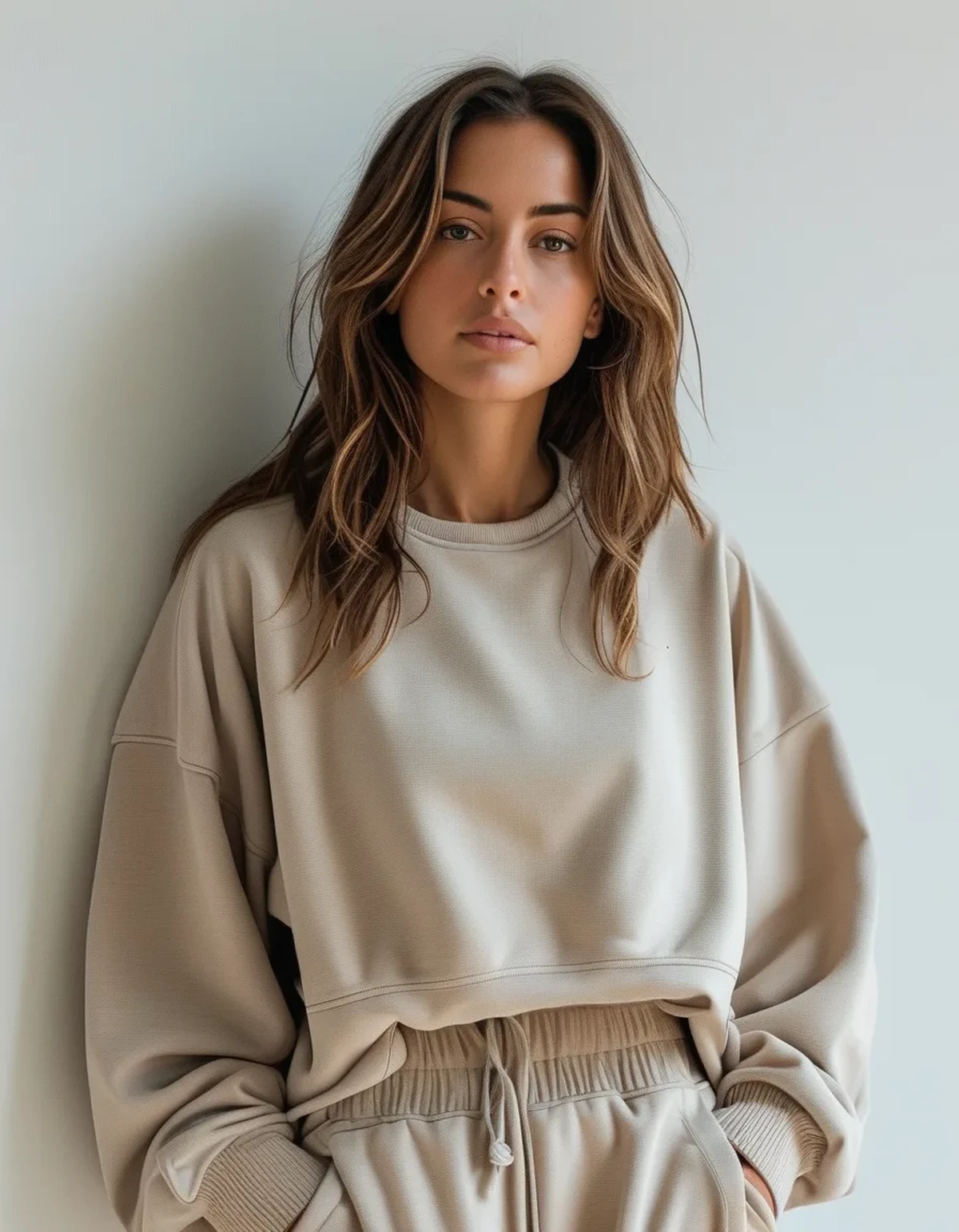
Layering two neutrals should look effortless, but pick two shades too similar and the outfit reads as one flat block instead of a considered layer.
Why does layering two similar neutrals sometimes look like a mistake?
When two pieces sit too close in value — how light or dark they are — the eye can’t easily distinguish where one layer ends and the next begins, especially in photos or under flat lighting, which reads as unintentional rather than styled.
How much value contrast is actually needed between layers?
A noticeable but not extreme gap works best — think a light oatmeal base under a deeper taupe or camel outer layer, rather than two shades within a step or two of each other on a value scale.
Does texture help solve the same-tone blending problem?
Yes, significantly — pairing a matte piece with a slightly textured or ribbed piece in a similar tone creates visual separation through texture even when the color values are close, which is a useful trick when you want to stay in a tight tonal range.

What role does layer silhouette play in avoiding the blending issue?
Contrasting silhouettes — a fitted base layer under a looser, structured outer piece — create a visible boundary through shape alone, which helps even when color and texture are both fairly similar between the two pieces.
Is there a neutral pairing that almost always works for layering?
A cream or oatmeal base with a deeper taupe, camel, or espresso outer layer tends to be one of the more reliable combinations, since the value gap is built in without requiring a bold color choice.
FAQ: Layering Neutrals Questions, Answered
Can black and white be layered as ‘neutrals’ the same way?
Yes, though the extreme value contrast reads more high-fashion or stark than the softer tonal layering typical of warm and cool mid-neutrals.
Does lighting change how layered neutrals read in photos specifically?
Yes — flat overhead lighting flattens value differences more than natural side lighting, so photographing layered neutral outfits in daylight shows the intended depth more accurately.
Should accessories break up a two-neutral layered look?
A small pop of contrast (a bag or shoe in a different value) can help anchor the outfit further, though it’s optional if the layering itself already has enough contrast.
TL;DR:
- Neutrals too close in value blend into one flat block instead of reading as layers
- A noticeable value gap between pieces keeps the layering intentional-looking
- Texture and silhouette contrast both help even when color tones are close
- Cream-to-camel or oatmeal-to-espresso pairings are reliably safe layering combinations
Next time you layer two neutrals, hold them side by side in daylight first — if you can’t easily tell them apart at a glance, the outfit probably can’t either.
Keep Reading
This article is for general informational and styling purposes only. Fit, sizing, and product availability may vary.