How to Avoid Neutral Activewear Looking Washed Out on You

Quick Answer: Choose neutrals with slightly more warmth or depth than pure beige or ivory if you tend to look washed out — camel, taupe, and warm greige generally flatter a wider range of skin tones than very pale, flat neutrals, and adding texture or a contrasting accessory helps regardless of the exact shade.
Why do some neutral shades wash people out more than others?
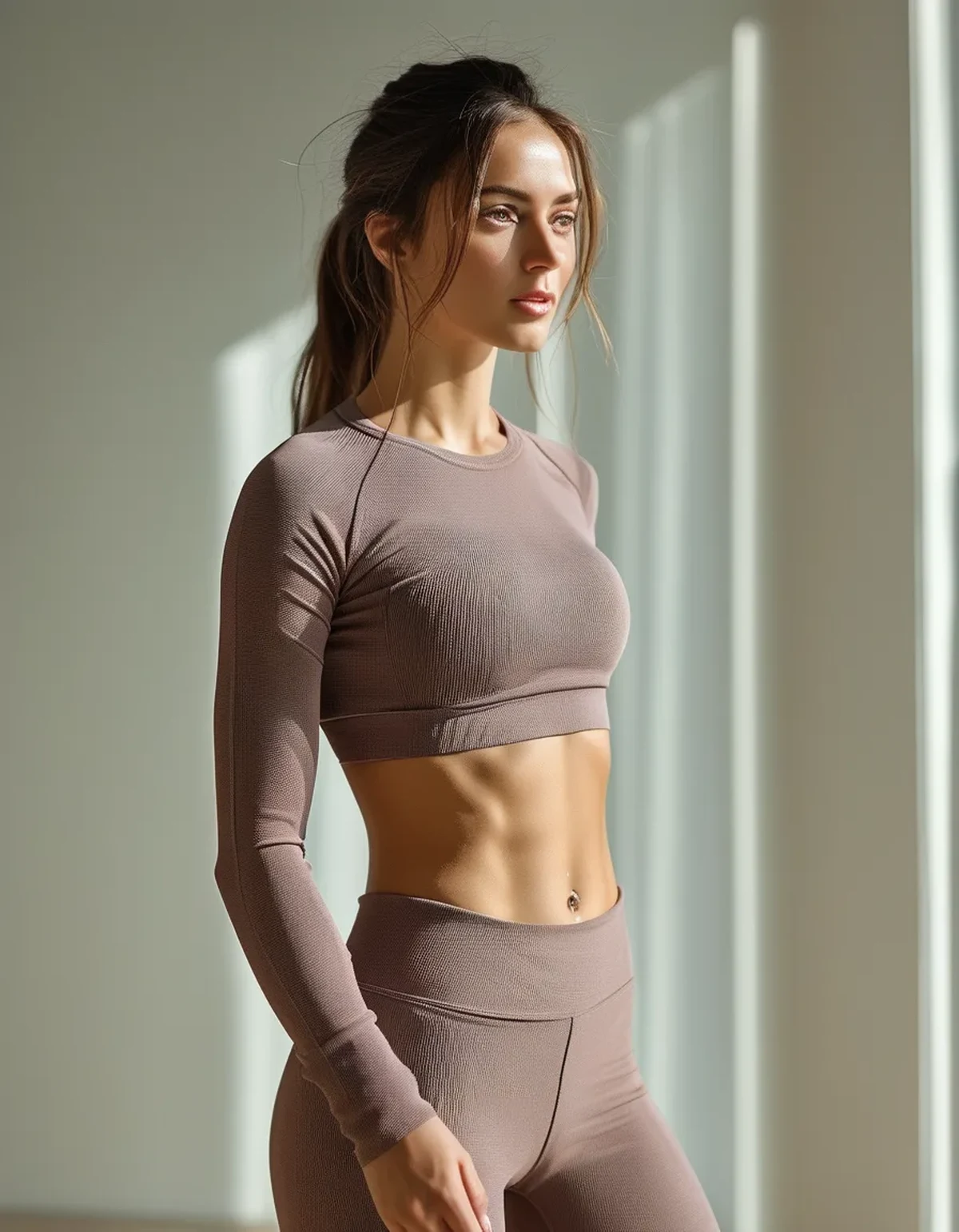
The issue is usually contrast, not the color category itself — a very pale, low-contrast neutral sitting close to your own skin tone can blur the line between outfit and complexion, making both look flatter. Neutrals with more depth (camel, taupe, chocolate) create enough contrast against most skin tones to avoid this effect.
Does skin undertone actually matter for choosing a neutral shade?
Somewhat — warm undertones generally pair well with warm neutrals (camel, warm taupe) while cool undertones often look fresher in cooler neutrals (greige, dove gray) — but this is a mild optimization, not a strict rule, and depth of shade tends to matter more than warm-versus-cool for avoiding a washed-out look.
Can texture actually fix a neutral outfit that feels flat?
Yes, meaningfully — a ribbed, waffle-knit, or textured fabric catches light differently across its surface, creating visual dimension that a completely smooth, flat fabric in the same color lacks. This is often a faster fix than switching the actual color if you already own the piece.
What’s the easiest styling fix if you’re stuck with a washed-out neutral piece?
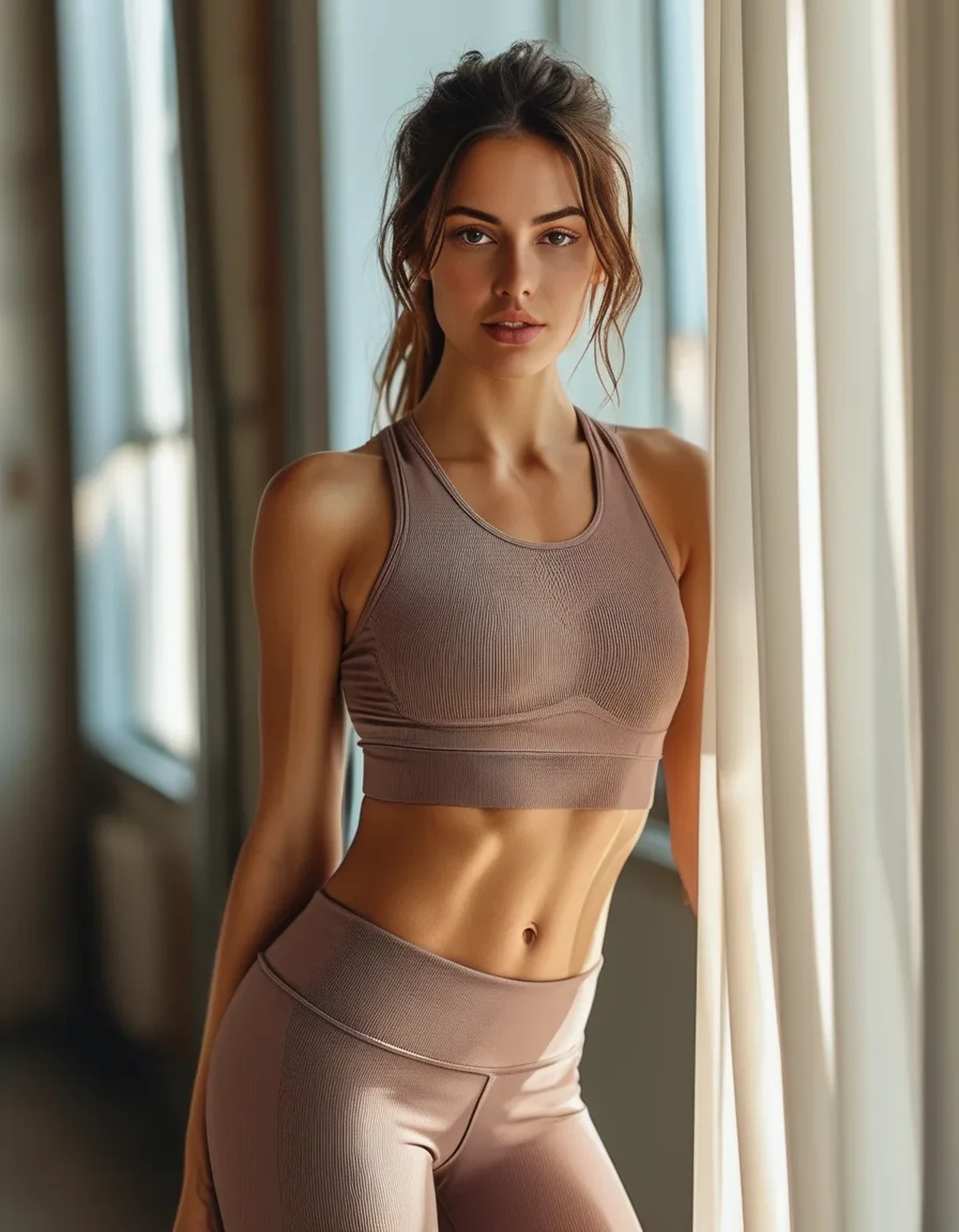
Add contrast through hair, makeup, or one accessory rather than changing the whole outfit — a darker hair color already provides natural contrast, and something as simple as a contrasting shoe or a bold lip can rebalance a look that otherwise reads as flat.
Building a Neutral Wardrobe That Doesn’t Look Boring
The mistake isn’t wearing neutrals — it’s wearing only the palest version of every neutral, which flattens the whole wardrobe into one low-contrast zone. Mixing light, medium, and deep neutrals within the same wardrobe (not just the same outfit) creates variety while staying within a cohesive palette.
FAQ: Neutral Activewear and Skin Tone, Answered
Is there one neutral shade that works for almost everyone?
Medium-depth taupe and camel tend to be the most universally flattering since they avoid the extremes of very pale or very dark, though individual results still vary.
Does this washed-out effect apply to darker skin tones too?
Yes, though differently — very pale neutrals can create strong contrast rather than blending, which some people like and others find harsh; the fix there is often the same texture and accessory approach.
Should you avoid pure white or ivory activewear entirely if you wash out easily?
Not entirely — pairing it with a contrasting accessory or darker bottom half usually solves the issue without needing to eliminate the color from your wardrobe.
TL;DR:
- Washed-out neutrals are usually a contrast problem, not a color category problem
- Deeper neutrals like camel and taupe create more contrast against most skin tones
- Texture adds visual dimension that flat fabric in the same color lacks
- One contrasting accessory can rebalance an otherwise flat neutral outfit
Neutral doesn’t have to mean flat — the fix is usually about depth and contrast, not avoiding the palette altogether.
Keep Reading
This article is for general informational and styling purposes only. Fit, sizing, and product availability may vary.