How to Build a Neutral Wardrobe That Doesn't Read as Boring
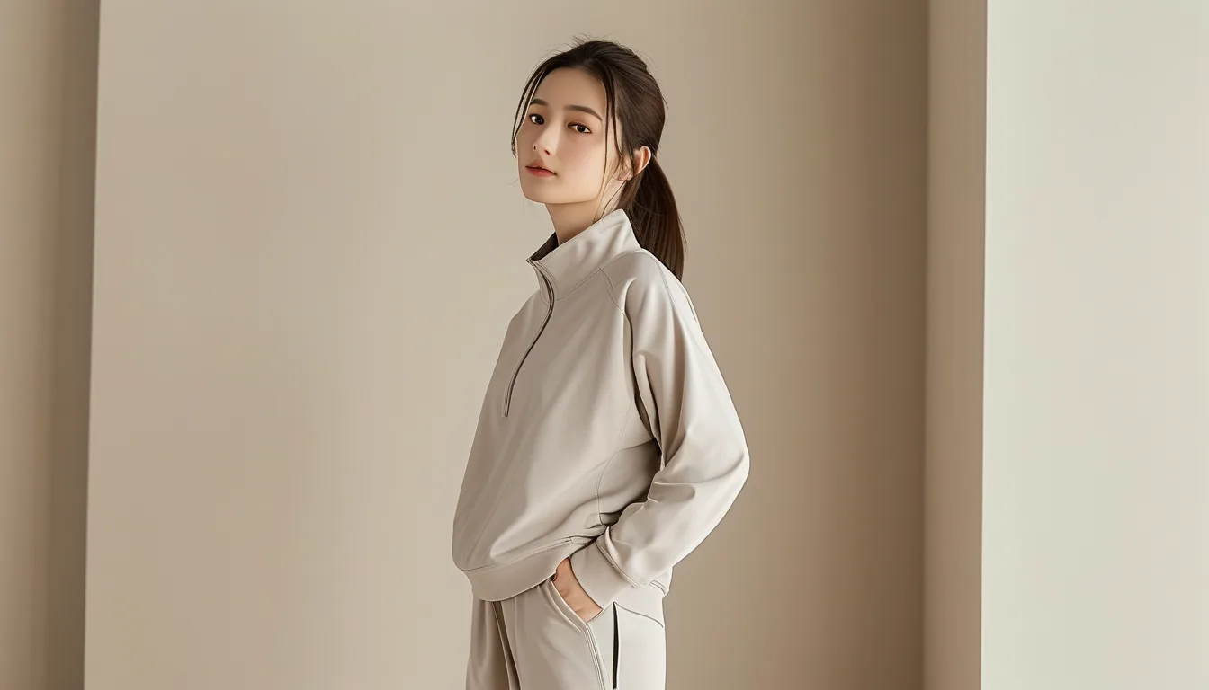
Quick Answer: A neutral wardrobe avoids looking flat by varying texture (matte versus shine, knit versus woven), layering slightly different shades within the neutral family rather than one flat tone throughout, and using silhouette and proportion as the visual interest instead of color — the mistake that makes neutral wardrobes look boring is treating ‘neutral’ as ‘identical,’ rather than as a coordinated but varied palette.
A neutral wardrobe reading as boring almost always traces back to flatness — same shade, same texture, same silhouette — rather than to the neutral colors themselves.
Why do some neutral outfits look chic while others look flat?
Texture and tonal variation are the difference — an outfit combining a ribbed cream sweater, tailored camel trousers, and a smooth leather bag reads as intentional and rich, while an outfit in one identical flat beige from head to toe reads as visually monotonous regardless of how well each piece fits.
How much tonal variation should exist within a neutral outfit?
2-3 distinct but complementary shades — cream, camel, and chocolate together, for example — generally reads as more sophisticated than a single uniform tone throughout. The goal is coordinated variation, not an exact color match across every piece.

What role does silhouette play when color isn’t providing visual interest?
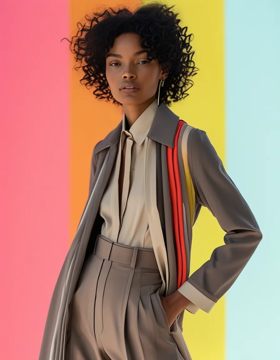
With a limited color palette, proportion and silhouette carry more of the visual weight — a fitted top with wide-leg trousers, or a structured blazer over a flowy dress, creates shape-based interest that pure color variety would otherwise provide in a bolder wardrobe.
Myth vs Fact: Neutral Wardrobes
Myth: A neutral wardrobe means everything should be the exact same shade. Fact: Varying shades within the neutral family (cream, tan, gray, black) creates more visual richness than a single uniform tone.
Myth: Neutral wardrobes only work for minimalist personal styles. Fact: Texture, silhouette, and accessory choices let a neutral wardrobe express plenty of personal style variety.
Myth: Adding one bold accent piece ruins the neutral aesthetic. Fact: A single accent color or statement accessory often sharpens a neutral outfit rather than undermining it, as long as it stays intentional and singular.
FAQ: Neutral Wardrobes, Answered
What neutral shades pair well together for beginners building this kind of wardrobe?
Cream, camel, and chocolate brown form a reliably cohesive trio that works across most seasons and skin tones.
How do I add visual interest without breaking the neutral palette?
Mix matte and shiny textures, and vary knit weights and fabric weaves, rather than reaching for a bold color.
Is it okay to include black and white in a neutral wardrobe, or should it stay warm-toned only?
Both work — the key is internal consistency (staying warm-toned or cool-toned as a general rule) rather than mixing undertones inconsistently.
TL;DR:
- Flat, identical shades and textures are what actually make neutral wardrobes look boring
- Combining 2-3 complementary neutral shades reads as more sophisticated than one flat tone
- Silhouette and proportion carry more visual weight when color variety is limited
- A single intentional accent piece can sharpen, not undermine, a neutral outfit
Neutral doesn’t have to mean flat — it just means the visual interest has to come from texture and shape instead of color.
Keep Reading
This article is for general informational and styling purposes only. Fit, sizing, and product availability may vary.